People of the Internet: I need your input!
I pinned this image about 5 months ago when we were closing on our home:

I LOVE how this looks and since then I've thought about painting my own window frame. I know there are a lot of orange haters out there, but I actually like the orange. I would be open to more reddish-oranges or maybe even coral. I could explore other color options, but let's get over the first hurdle...
Here are two vantage points of my kitchen (these are the listing images):
If you notice, you can't really see the window unless you are IN the kitchen. That way, my fear of a color being 'too much' would be lessened.
I mentioned here that Mark and I purchased counters, tile, and a sink for our upcoming remodel (scheduled to start next week!!!) so here is what the new scheme will be:
floor tile as-is
cabinets and cabinet hardware as-is
sink hardware as-is
counter top (not exact color but close) :

back splash tile (also to go on 'dead end' from back splash level to floor):

sink (similar):

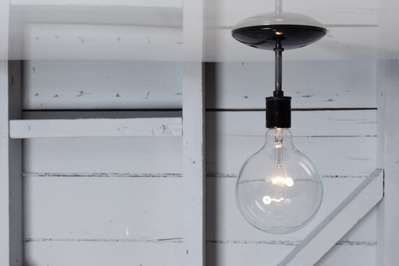
light above sink:

As seen here in our 'after' photos, the walls are Behr: Dolphin Fin (grey) and "dead end" wall is chalkboard paint.
So, as you see, I have a lot of flexibility to add color.
Second point, and most difficult to master: The window is semi-new, replaced by the previous owners. It is metal and does not have the mullions like the inspiration image. Therefore, it would be very difficult to go back to simple white metal for a future owner or if we didn't like it. We would either have to strip off the paint, which could still damage the white paint on the metal underneath, or we would have to paint over it.
Now that I've presented all of the evidence, I need you as my jury to help me decide! (although my husband gets the last word)

yes or no?
p.s. how do you like our scheme so far? I'm FREAKING OUT and can't wait to see the finished product!!! :)


I like it! It's fun and something small to keep you happy while you're in that area. Lord knows we all need more reasons to stay in the kitchen ;) I feel like if you just paint over it with white before moving no one will ever know it was different to begin with. Heck, maybe even just leave it on and if you get a lot of negative feedback then take the time to paint over it. Like you said, you will probably end up selling to a buyer with similar taste!
ReplyDeleteWhat about building a "faux" window frame out of some wood, painting that orange and mounting it around the window... that way if you don't love it you could remove it!
ReplyDeleteI agree wholeheartedly! I mean, would someone really rule out buying my house because a window frame was painted?
ReplyDeleteI'm not sure that would achieve the look I'm going for, but it's definitely food for thought! Thanks for the input!
ReplyDeleteGo for it! I think it would be a great attraction to the kitchen. I'm excited to see your kitchen transformation too :)
ReplyDeleteThanks Erin! Isn't that inspiration kitchen a dream!? I'm hoping our kitchen looks half as good when it's complete!
ReplyDeleteThat's a good idea to wait until everything is done. I agree and that is most likely what will happen, anyway! Other people have asked if we were doing window treatment there which would be a great way to bring in color, but that kitchen doesn't get much natural light as it is so I'd had to cover it at all. A fun color would bring some life in! I really like the orange in the image, but it is debatable for the most part. I know orange doesn't fall high on many people's 'favorite colors' list! haha
Thanks Kelly!! I'm BEYOND excited for this to start. I'm counting the days!
ReplyDeleteAm I the only one that thinks that window looks like natural wood instead of painted? I just can't see the usual aluminum window installed in most houses looking the same. Andrea's idea seems to be the best approximation of the look being the same.
ReplyDeleteEverything you've chosen so far has been amazing, and although orange is not my favourite of colours, I can see it working as a really nice contrast with the other bits you've chosen.
ReplyDeleteI can't wait to see the finished product!